As the saying goes, a picture is worth a thousand words. Many individuals best process and learn information through visuals, and many concepts are best presented through an image or illustration. However, there is a crucial question to ask about visual communication: If it’s saying a thousand words, are they the correct words?
Visual communication is incredibly important, particularly with comparative information. What’s the best way to show how two or more data sets compare, and to ensure they’re understood by the target audience? Generally speaking, charts and graphs are the perfect go-to for communicating this type of information, particularly as it allows you to show instead of telling the information.
FileMaker has ten types of charts and graphs available for your databases. Each communicates in different ways, allowing them to be better at communicating some types of data than others.
Column & Bar Charts
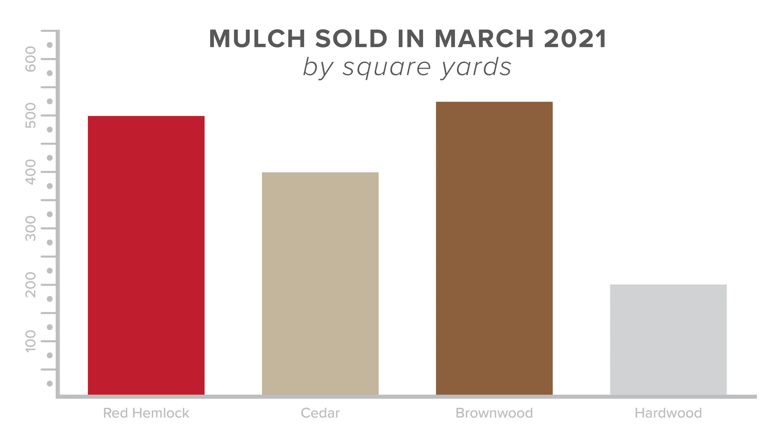
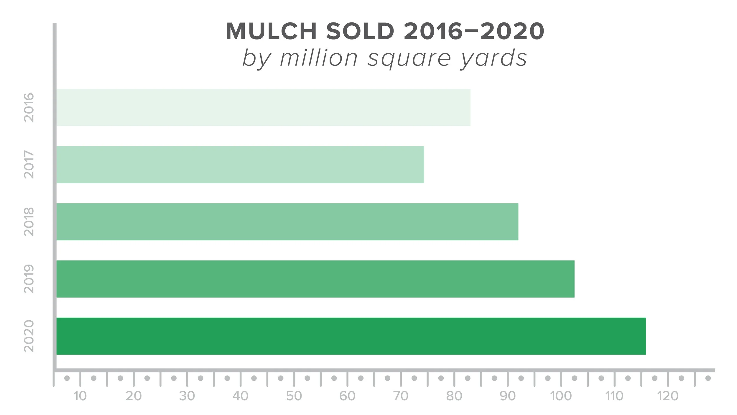
Column charts and bar charts are excellent for comparing apples-to-apples data (meaning, similar data that can directly be compared without any exceptions or outliers), as well as change over time so long as that change has been significant. For example, a landscape supply company might use them to compare how much mulch they’ve sold broken down by color. Or they might compare total mulch sales year-over-year.
How do you know when to use a column or a bar chart? Good graphing principles say it is better to have a wide chart than a tall one. The y-axis (the vertical axis, generally on the left-hand side) should be the short axis while the x-axis (the horizontal axis, generally on the bottom) should be the longer one.
Stacked Column & Stacked Bar
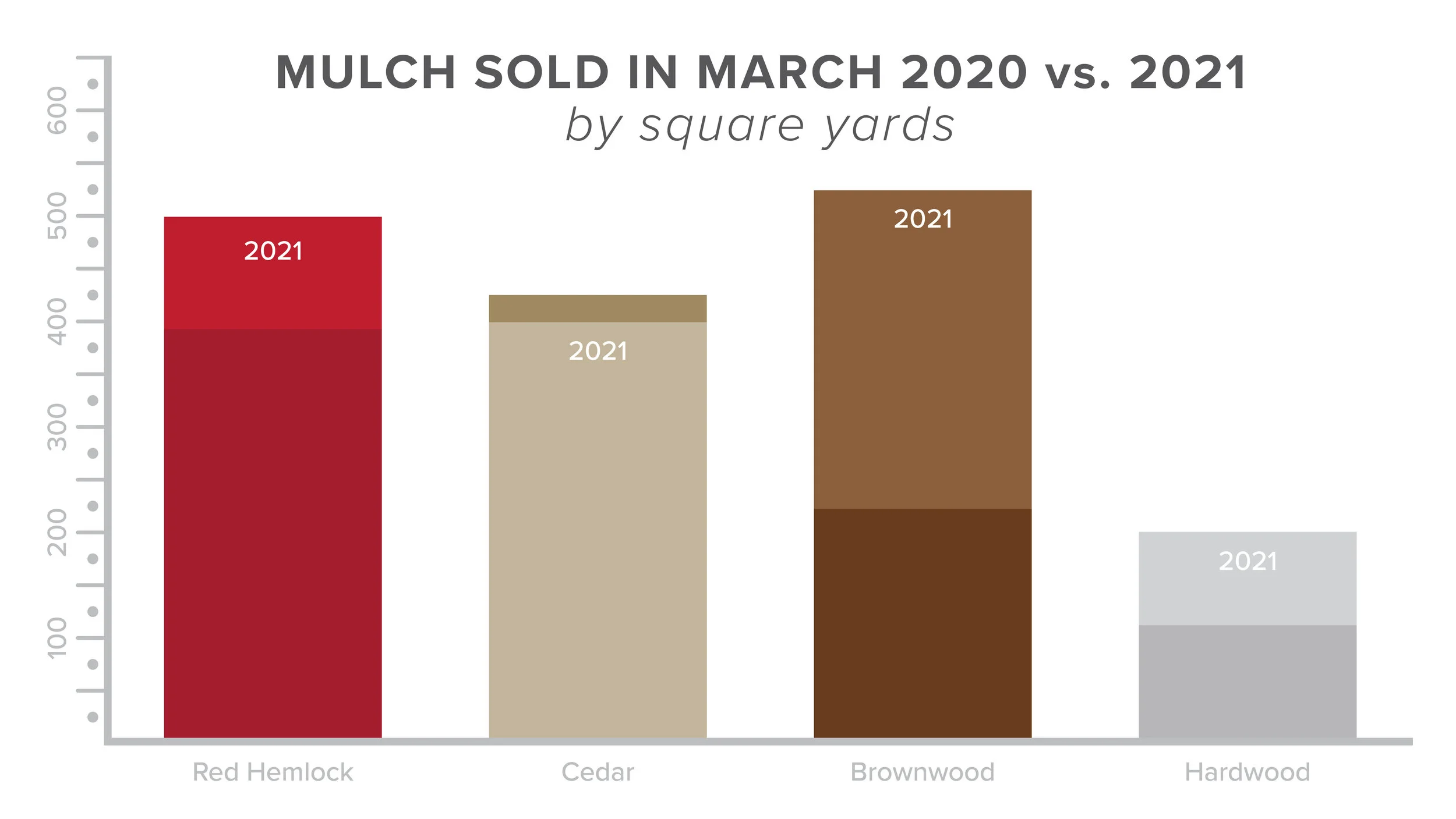
Stacked column and stacked bar charts are great for comparing multiple variables with how they’ve changed over time. They can be a combination of the two uses for their regular counterpart. Following the earlier example, a landscaping company might compare how much mulch they’ve sold broken down by color, compared to how much they sold the previous year.
Positive Negative Column
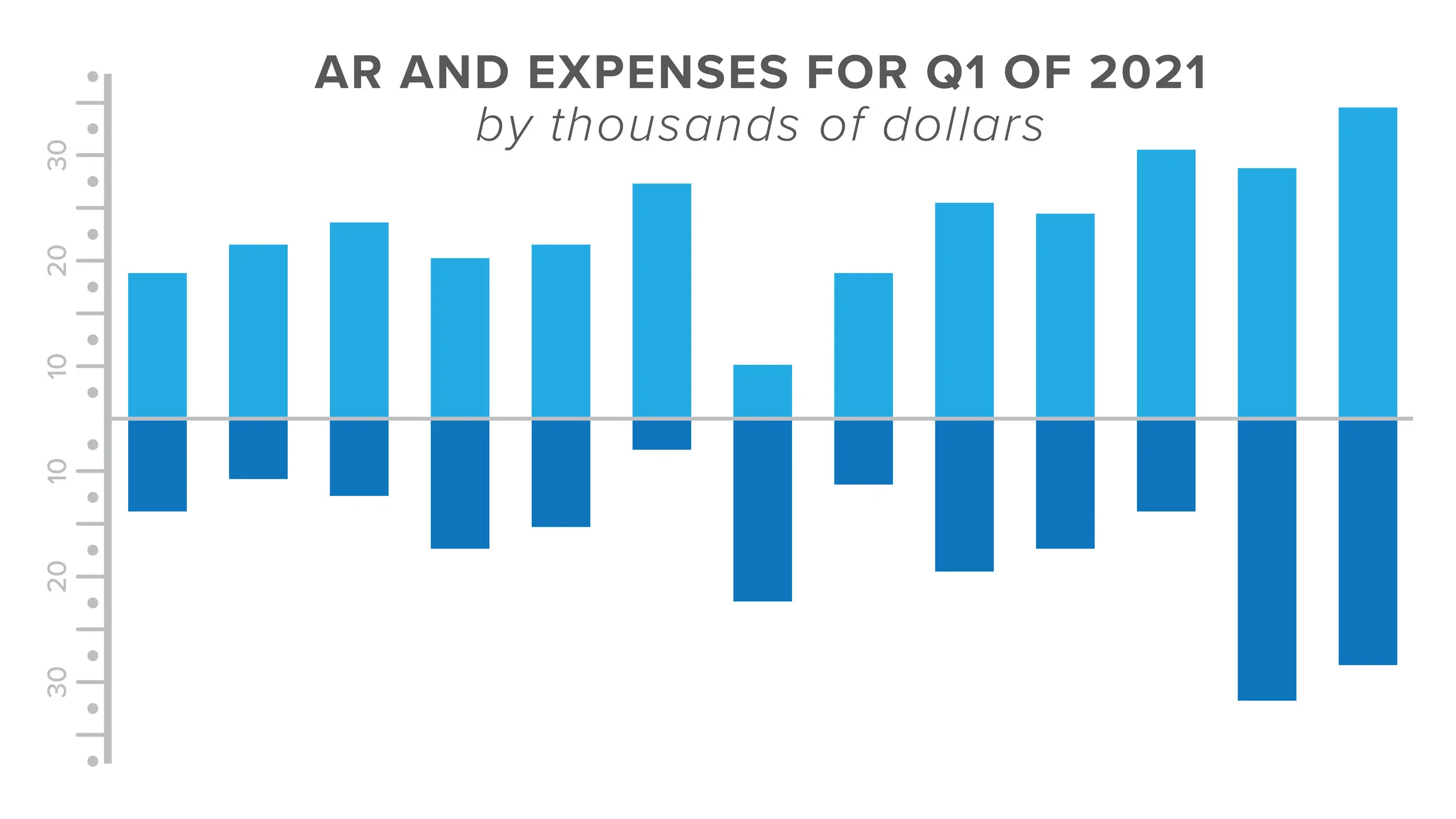
Positive Negative Column charts are useful to show day-to-day change where the amount of change each day is more important than the overall trajectory. They can also be used to showcase finances in a comparative manner.
A business owner might use this type of graph to track their income. They could show revenue versus expenses, or they could be used to demonstrate net versus gross income.
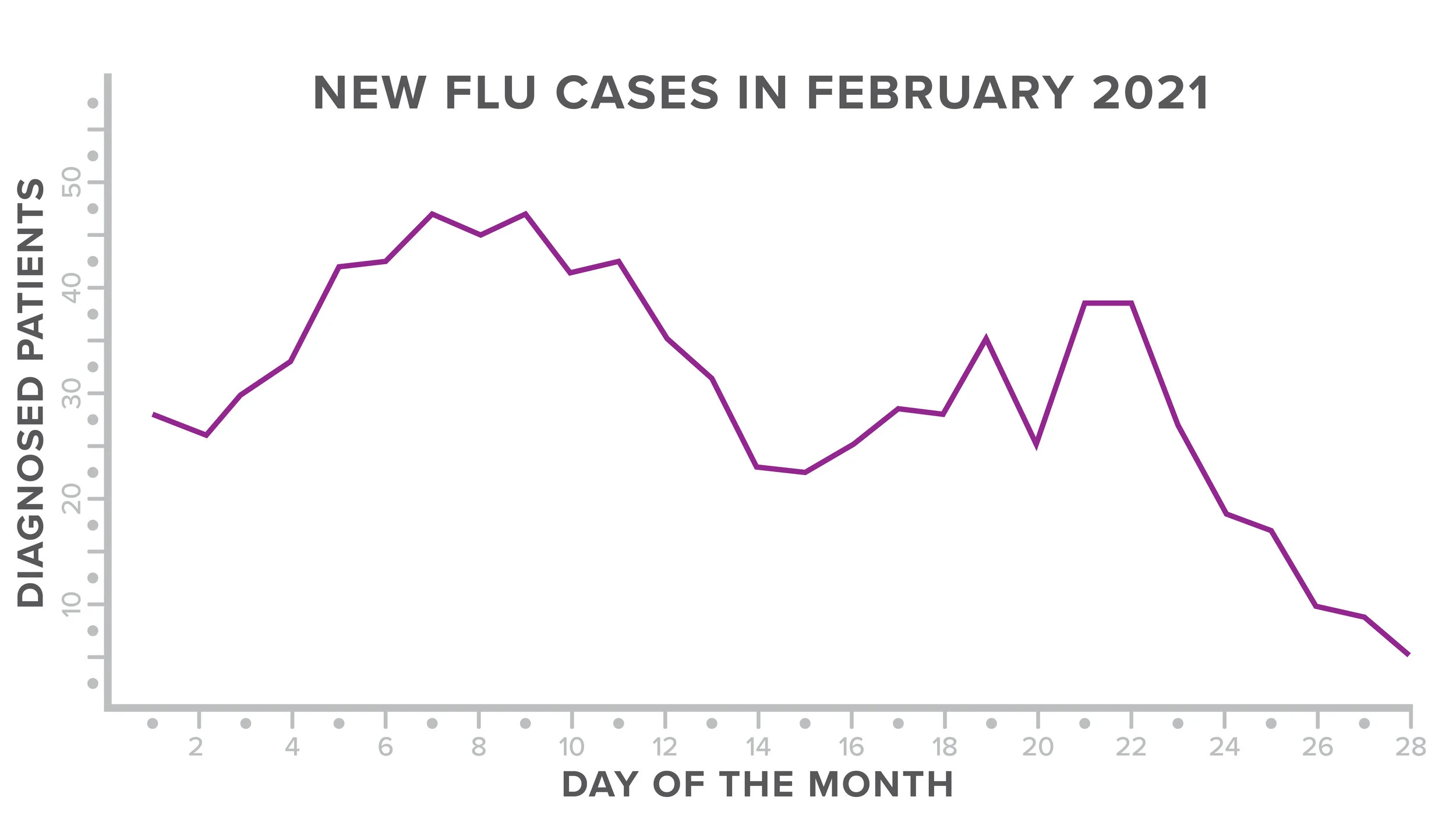
Line
Similar to column and bar charts, line graphs are useful for demonstrating change over time—but they’re able to demonstrate smaller changes than column and bar charts do. Viewers are able to better perceive and understand these smaller changes with a line graph. Line graphs can also track multiple KPIs at once. A medical practitioner may use this type of chart to document the number of confirmed flu cases in their area throughout a specific time period.
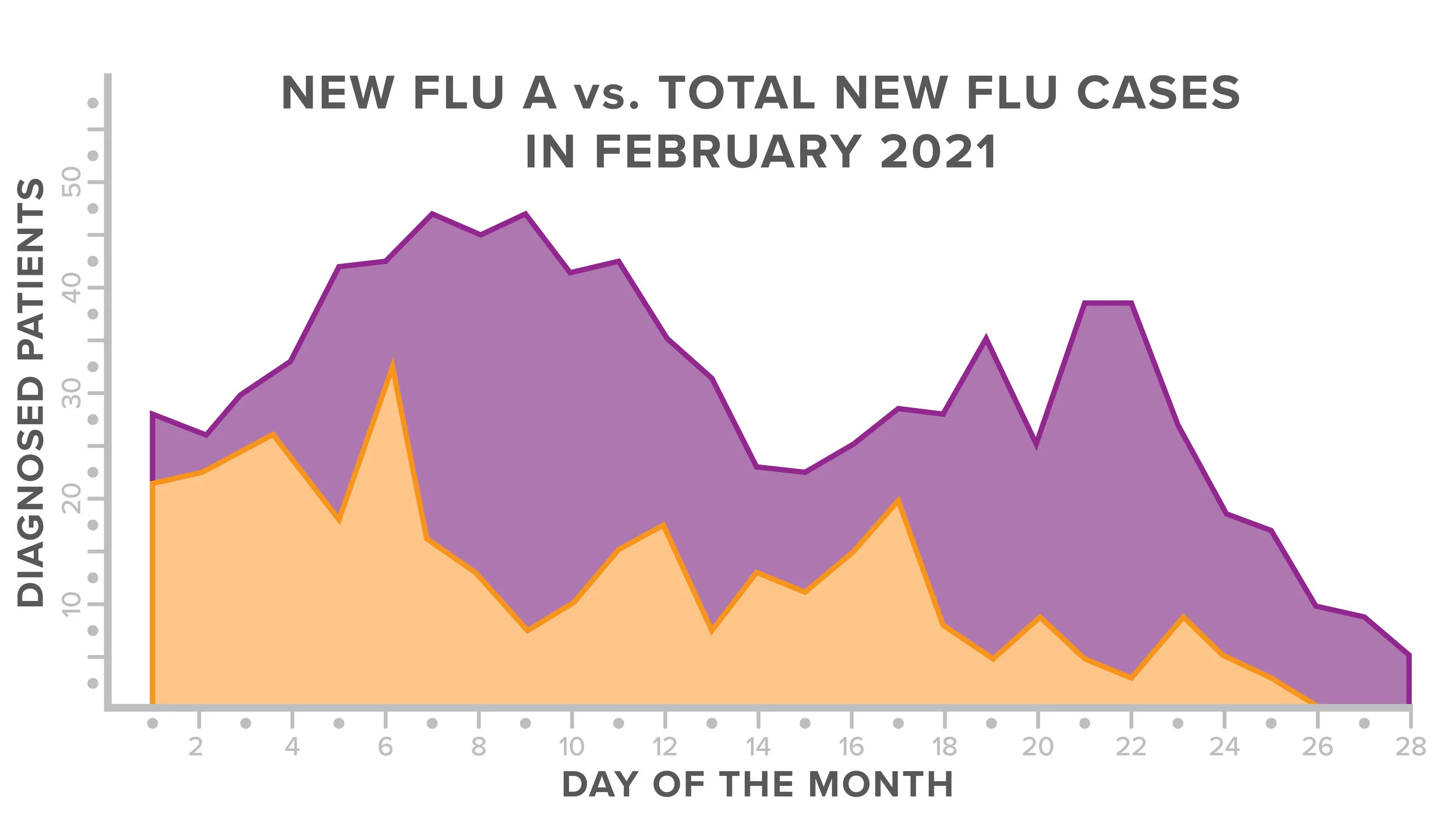
Area
Area graphs are considerably similar to line graphs, but they allow you to track related KPIs that can make up an entire category. The same medical practitioner tracking confirmed flu cases may want to have a second chart documenting how many Flu A versus Flu B cases are in their area, which an area graph would be excellent for.
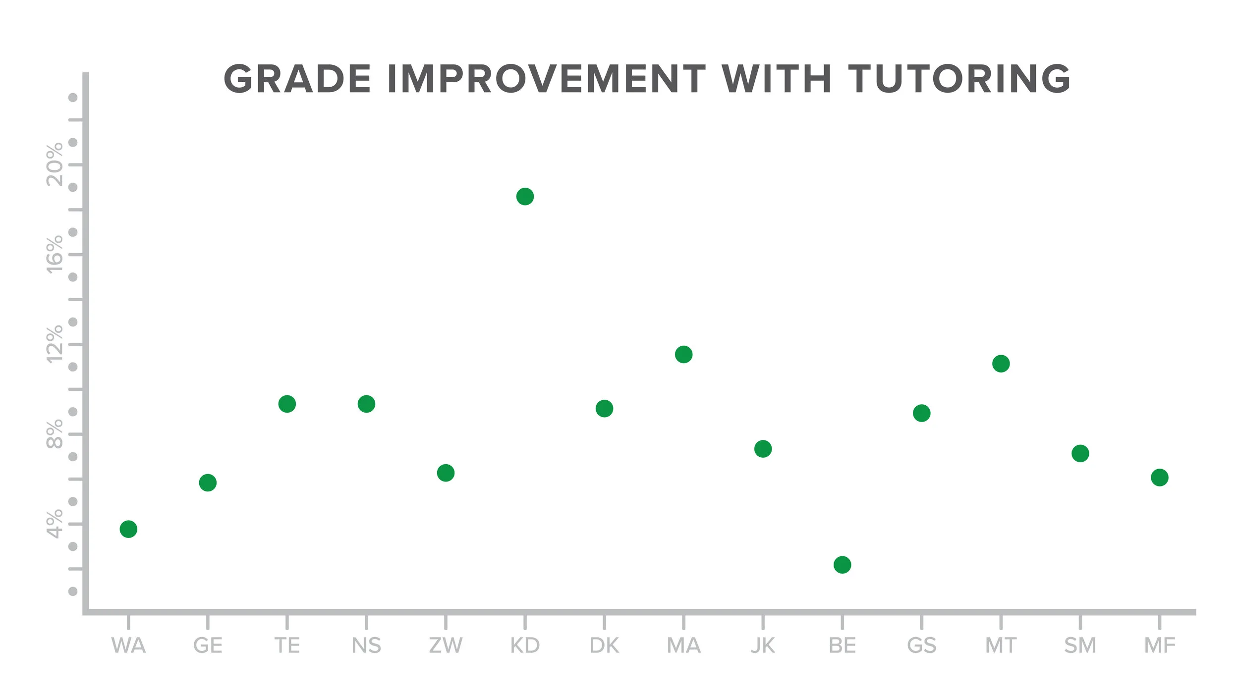
Scatter
Scatterplots demonstrate outcomes and allow you to identify a trend if it exists, but also any outlier data. While in research all data needs to be considered, there are instances where outliers should be identified and removed from the data set to prevent demonstrating unintentionally skewed information.
A teacher who provides after-school tutoring for their students may use a scatter plot to see how students who take advantage of that tutoring improve over a semester compared to students who are unable to, but would remove the outlier student who has a private tutor in addition to their assistance.
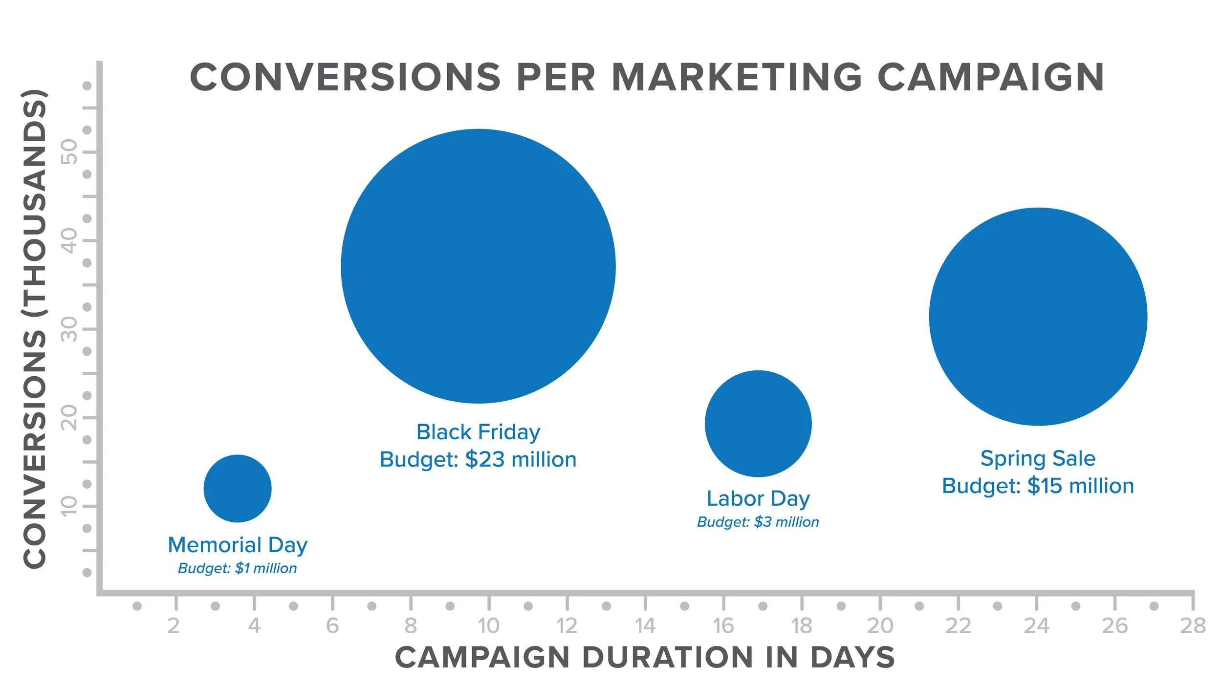
Bubble
Bubble graphs are excellent for when you need more than two or three data points, or when you are comparing nonequivalent information. Bubble graphs provide a context for the information presented to set within.
For instance, a bubble graph could be used to compare the results of several digital ad campaigns that are geared towards the same target audience, but have different budget amounts allowing for some to spend more than others.
Pie
Pie charts are frequently used to illustrate how a category breaks down into different segments.
However, pie charts are generally considered to be rarely useful for end users and are highly discouraged by instructional designers. Pie charts can allow viewers to understand relative different results for whatever is being measured—so long as there are significant differences between the categories. Similar to bar and column charts, they don’t work well when presenting information with small variances. But even then, pie charts don’t allow the viewer to precisely understand the differences. If you’re going to use a pie chart, we recommend only using them for surface level, at-a-glance information communication.
All of these graphs and charts have different nuances. When used together as intended, they can create powerful dashboards that easily communicate and visual data information or KPIs. Business owners can find them helpful for tracking business finances, inventory levels, or forecast future needs.
PK Information is a FileMaker-certified development agency serving the Tampa Bay, Miami Lakes, and Knoxville regions. We believe that great software can change everything.
LEARN MORE
Are you able to easily see how your organization is performing based on your specific KPIs? Would a well-designed dashboard created by information experts help you to better identify trends, trouble spots, or top-performing metrics? We’d love to discuss the possibilities with you! Please complete this form and we’ll connect shortly.


